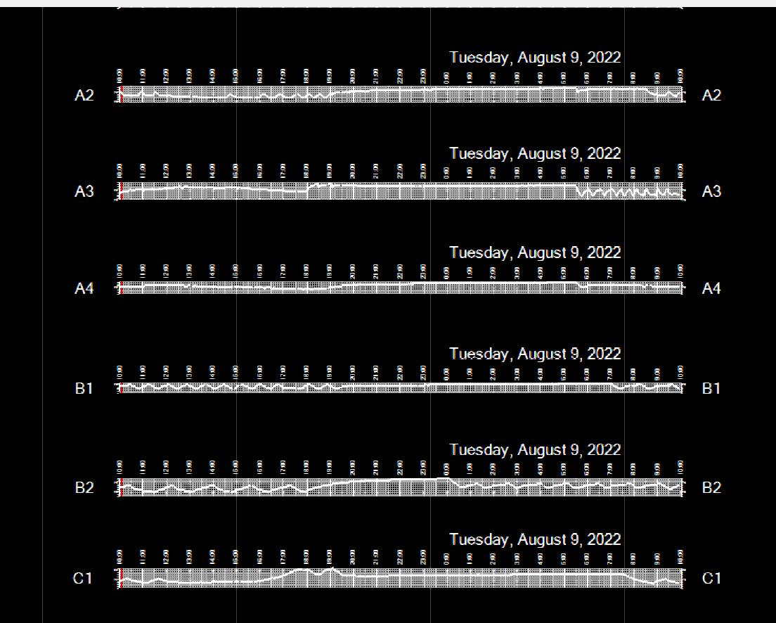
Here is an example how a display of temperature history can look like
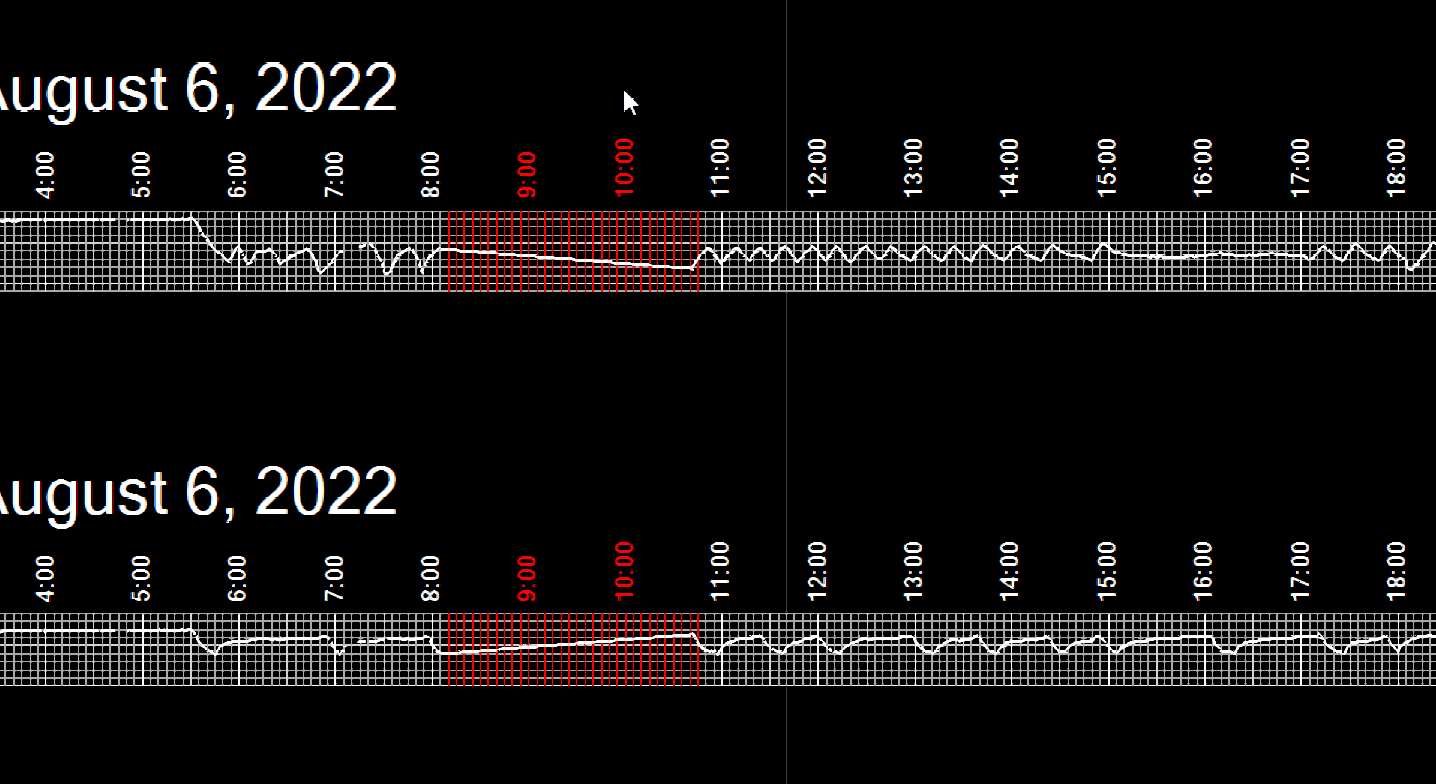
Here is a piece showing an interruption of trace data collection, for whatever reason. The grid lines for the times no data were collected are shows in red. Note, that such an outage affects the whole system, thus it shows up the same for all temperature file groups.